


The Challenge
No System, No Consistency, No Speed
When I joined Cymulate as the first Product Designer, the application was suffering from significant design debt. There was no centralized system, every page looked different, and engineers were reinventing components from scratch.
I needed to build a consistent, scalable design system from scratch that would unify the product experience while drastically reducing development time.
01
Visual Inconsistency
Every page looked slightly different, creating a disjointed user experience across the platform. Designers had no shared language or components to reference.
02
Slow Development
Engineers were reinventing the wheel for basic UI components, leading to long lead times for even simple features. A filter implementation could take days of back-and-forth.
03
Rigid Theming
The app was dark-mode by default, but the codebase was not set up to handle theming. Colors were hardcoded, making any future light mode or brand evolution difficult.
The Evolution
Four Years of Continuous Growth
This was not a one-time project. It is a living system that evolved through multiple phases, each adding new layers of maturity and capability.
2021
Foundation Phase
Audited the entire product, established core design tokens, and chose Atomic Design as the structural methodology. Built the first Figma library of atoms and molecules.
2022
Component Expansion
Scaled from basic atoms to a full component library: buttons, inputs, tables, modals, navigation patterns, and more. Introduced variant systems and documentation for the growing design team.
2023
Code Integration
Stepped into the codebase. Built the system on React + PrimeReact, wrote Sass styling for atomic components, created mixins and functions, and managed token logic. Opened my own PRs and served as code approver.
2024 - Present
Patterns, Templates & Scale
Extended into design patterns, page templates, and complex compositions. The system now powers the entire platform, and I continue shipping components directly to production.
The Approach
Atomic Design Meets Semantic Tokens
I structured the system using Atomic Design principles and implemented robust semantic tokens to support current theming and future evolution.
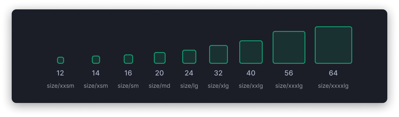
The System
Four Libraries, One Unified Language
The DSM is organized into four interconnected libraries. These placeholders will be replaced with your library screenshots.
Layer 01
Fundamentals
Design tokens, color palettes, typography scale, spacing system, elevation, and grid definitions. The foundation everything else builds on.
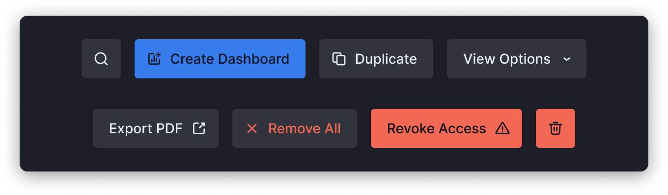
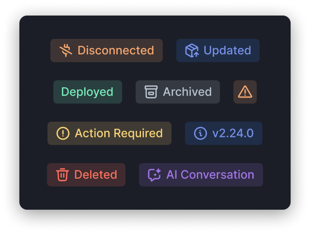
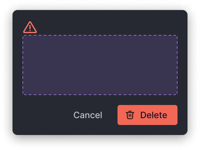
Layer 02
Components
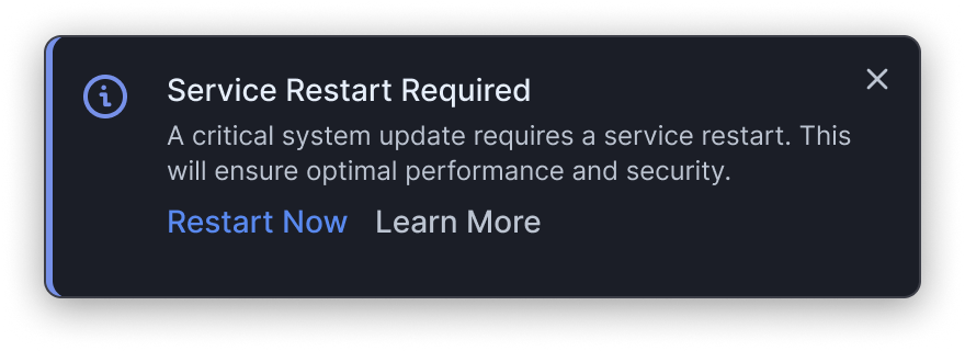
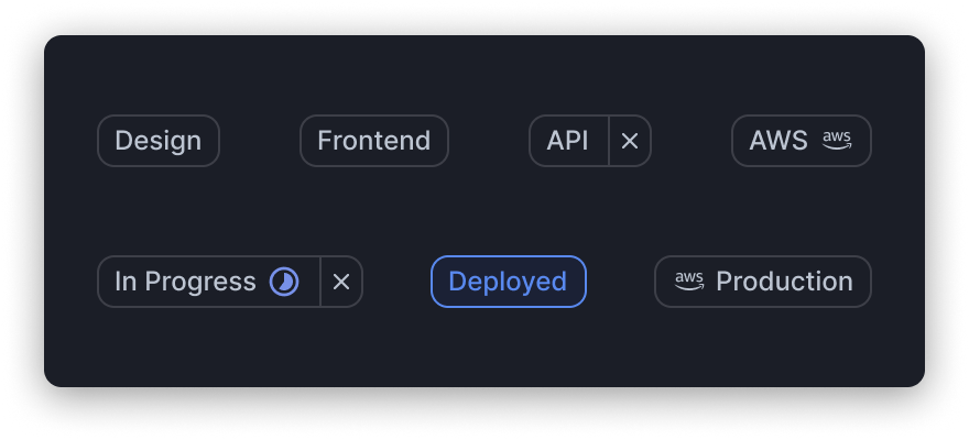
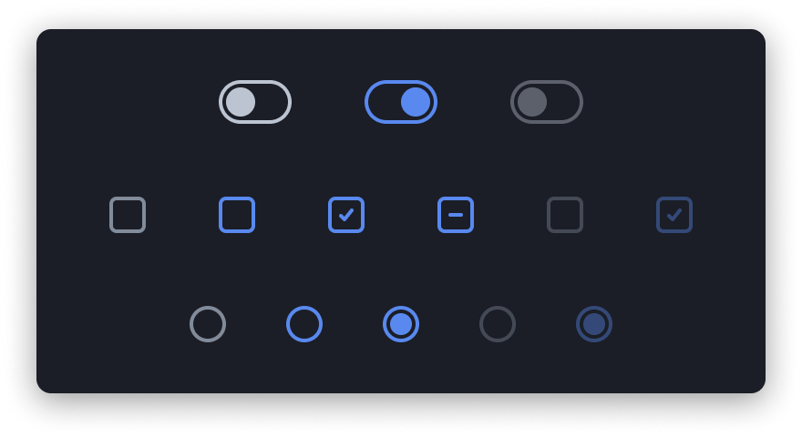
The full component library: buttons, inputs, tables, modals, dropdowns, navigation elements, and more, with full variant coverage and interaction states.
Layer 03
Design Patterns
Reusable compositions and page-level patterns, from form layouts and filter bars to dashboard arrangements and wizard flows.
Layer 04
Icons
A curated icon library for cybersecurity workflows with consistent stroke widths, optical sizing, and semantic naming conventions.
Bridging the Gap
The Designer Who Ships Code
This was not just a Figma exercise. To ensure the design vision was executed with precision, I stepped directly into the codebase.
Hands-on Implementation
I wrote Sass styling for atomic components, created mixins and functions, and managed token logic in code.
- Opened my own pull requests for every component.
- Served as code reviewer and approver for DSM updates.
- Built the bridge between Figma variables and Sass tokens.
- Eliminated handoff friction by owning design and implementation.
Component Spotlight
The Data Table: Heart of the Platform
The most complex challenge was the Data Table, the core workspace element of Cymulate. It needed to handle the complexity of cybersecurity data at scale.
A Workspace, Not Just a Grid
By standardizing this single complex component, we solved a large portion of the UI complexity for the rest of the application.
- Real-time resizable columns with persistent state.
- Column ordering and visibility toggles.
- Advanced filtering with saved presets and URL syncing.
- Inline actions, bulk operations, and contextual menus.
Governance & Adoption
A System Is Only as Good as Its Adoption
Building components is only half the battle. I established governance practices that ensured the system was used correctly and evolved sustainably across R&D.
1
Single Source of Truth
Storybook maintained collaboratively by the dev team and myself, mirroring every Figma component.
2
Documentation
Comprehensive Figma documentation for every component with usage guidelines, dos and don'ts, and implementation notes.
3
Onboarding
Personal onboarding sessions for every new hire, designers and developers alike, on the design system workflow.
4
Training
Bi-annual training sessions for the entire R&D team to keep everyone aligned with updates and best practices.
Cross-Functional Impact
Transforming How Teams Build Product
The design system became a shared language for design, engineering, product, and QA.
Design
Faster Iteration
New designers onboard in days, not weeks. High-fidelity mockups are assembled from real components instead of drawn from scratch.
Eng
Ship Faster
Developers pull from a shared component library with clear API contracts. The code matches the design because they share the same source.
Product
Predictable Timelines
Feature scoping became more accurate because teams know what is already built and which DSM components each feature requires.
QA
Fewer Visual Bugs
Standardized components mean standardized behavior. QA can focus on business logic rather than visual inconsistencies.
The Impact
Infrastructure Investment That Paid Off
The investment in design system infrastructure delivered measurable velocity improvements across the organization.
Days -> Min
Filter implementation time
1.5wk -> 2d
Complex flow creation
~0
UI bugs from inconsistent styling
Reflection
What I Have Learned and What Is Next
Lessons from 4+ years building DSM
Looking back, while PrimeReact served us well as a foundation, if I were rebuilding today I would opt for a lighter, more flexible base such as headless primitives with a utility-first styling layer.
The biggest lesson: a design system is never done. It is a living product that requires product thinking, user research, and continuous iteration. The teams that use it are your users.
Four years in, the system keeps growing, and I still contribute to both Figma libraries and production code directly. That dual ownership is what makes it work.