The Problem
A Dashboard That Could Not Keep Up With Its Users
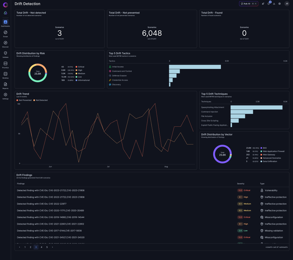
Cymulate dashboards are a critical product surface for monitoring posture, tracking drift, and reporting to stakeholders. Over time, the widget system accumulated enough UX debt to slow down exploration and adoption.

01
No Data Exploration
Widgets were mostly static displays. Users could not click chart elements to filter or drill down and had to leave the dashboard to investigate.
02
Rigid Layout
All widgets were fixed-size, so teams could not prioritize key visualizations by resizing cards or shaping the grid to match their workflow.
03
Clunky Creation Flow
Creating a new widget required navigating a dense multi-step form with too many decisions up front and no clear visual preview.
Process
From Audit to Implementation
I owned this project end-to-end across UX research, interface design, Storybook systemization, and production implementation.
01
Audit & Benchmark
Mapped every widget type, documented interaction gaps, and benchmarked against Datadog, Grafana, and Looker dashboard patterns.
02
Prioritize Impact
Identified the four highest-impact improvements using user feedback frequency and implementation feasibility.
03
Design + Build
Designed in Figma and implemented the widget components, dashboard grid, and creation flow directly in React + TypeScript.
04
Ship + Iterate
Published the components in Storybook, integrated in production, and iterated based on internal testing and stakeholder feedback.
The Solution
Four Improvements That Transformed the Experience
Each improvement works independently but compounds into a dashboard users can actively explore instead of passively read.

Feature 01
Isolate Mode
Click any legend item in a line chart to isolate that series while preserving low-opacity context lines.

Feature 02
Click to Filter
Turned every chart element into an interaction point that applies dashboard-level filtering with visible filter chips.

Feature 03
Widget Resizing
Added small, medium, and large presets so teams can prioritize insight-heavy widgets without manual drag complexity.

Feature 04
Create Widget Flow
Redesigned the creation experience with progressive disclosure and a live preview panel to reduce abandonment.
Deep Dive — Feature 01
Isolate Mode in Line Charts
The Problem With Multi-Line Charts
Security dashboards often show five to ten overlapping trend lines. Isolate mode makes single-series analysis immediate without losing the broader context.
- Single-click to isolate and click again to restore all series
- Hover previews before committing the isolate state
- Ghost lines remain visible for trend context
- Tooltip follows the isolated series for precise readouts

Deep Dive — Feature 02
Click to Filter Across All Widget Types
Every Chart Element Is Now Interactive
Clicking a pie segment, bar, line-point, or table row applies a dashboard-level filter. The dashboard became an exploration tool rather than a static report.
- Consistent hover states across all chart types
- Click applies the value as a dashboard-level filter
- Filter chips appear in the toolbar for visibility and removal
- Works across pie, bar, line, and table widgets
Deep Dive — Feature 03
Flexible Widget Resizing
Let Users Prioritize What Matters
The old fixed grid forced all widgets into equal importance. Resizing lets teams promote insight-heavy cards and de-emphasize lighter KPI surfaces.
- Three size presets: small, medium, and large
- Grid reflows automatically without manual rearranging
- Accessible from widget context actions
- Size preference persists across sessions

Deep Dive — Feature 04
Redesigned Create Widget Flow
From Overwhelming to Intuitive
The creation flow now uses progressive disclosure. Users focus on one decision at a time while the live preview updates continuously.
- Step 1: Choose chart type with visual previews
- Step 2: Select data source and configure dimensions
- Step 3: Customize appearance and filters
- Live preview updates throughout the flow

The Result
A Dashboard Built for Exploration
The four improvements converge into a cohesive experience: interactive widgets, flexible layout control, and dramatically clearer creation patterns.

Outcomes & Impact
Measuring Success
The redesigned widgets are rolling out. These are the primary metrics now tracked for impact.
TBD
Increase in dashboard engagement time
TBD
Widget creation completion rate
TBD
Click-to-filter adoption rate
Early qualitative signals are strong: internal stakeholders report noticeably better usability, and the Storybook library now acts as both living documentation and production source of truth.
Reflection
What I Learned
Dor P. · UX Designer & Design Engineer · Cymulate · 2025-2026
Owning both design and implementation changed the quality of decisions. Interactions like isolate mode only become truly solid after feeling state latency, rendering edge cases, and accessibility details in code.
The biggest advantage was fidelity without handoff drift. Designing and shipping in the same sprint kept intent intact and dramatically shortened feedback loops.
Dark, data-dense interfaces demand deliberate interaction affordances. Hover states, selection treatment, and filter visibility now carry more explanatory weight than static labels alone.